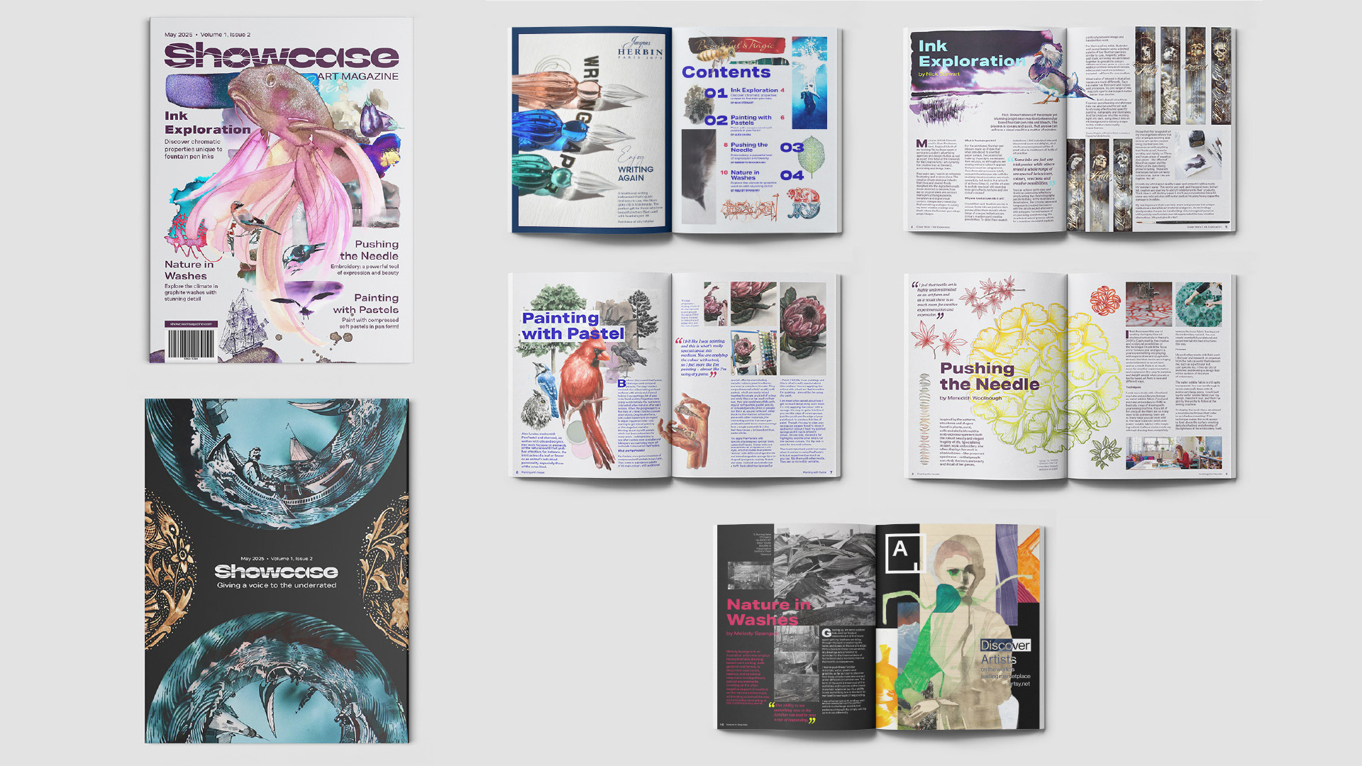
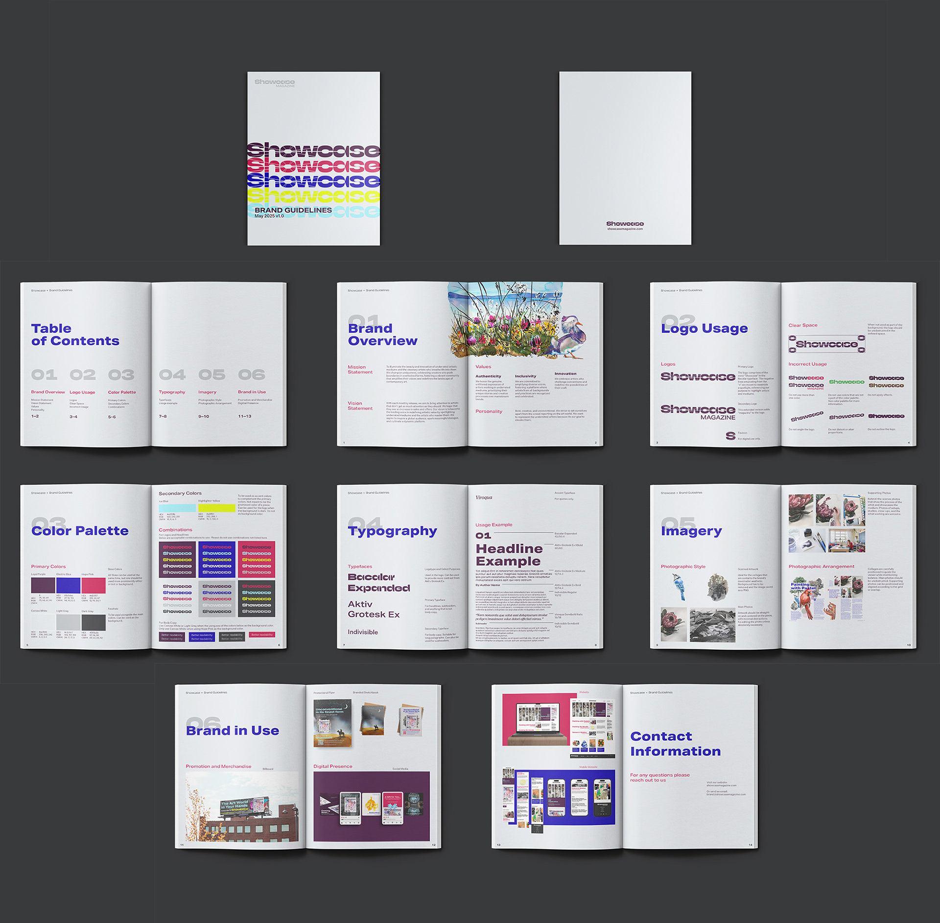
Magazine spreads
Tasked with making a brand identity for a magazine, the magazine itself, and various collateral materials. I wanted to challenge myself by delving into maximalist design, a style I was not used to, in branding and editorial design.
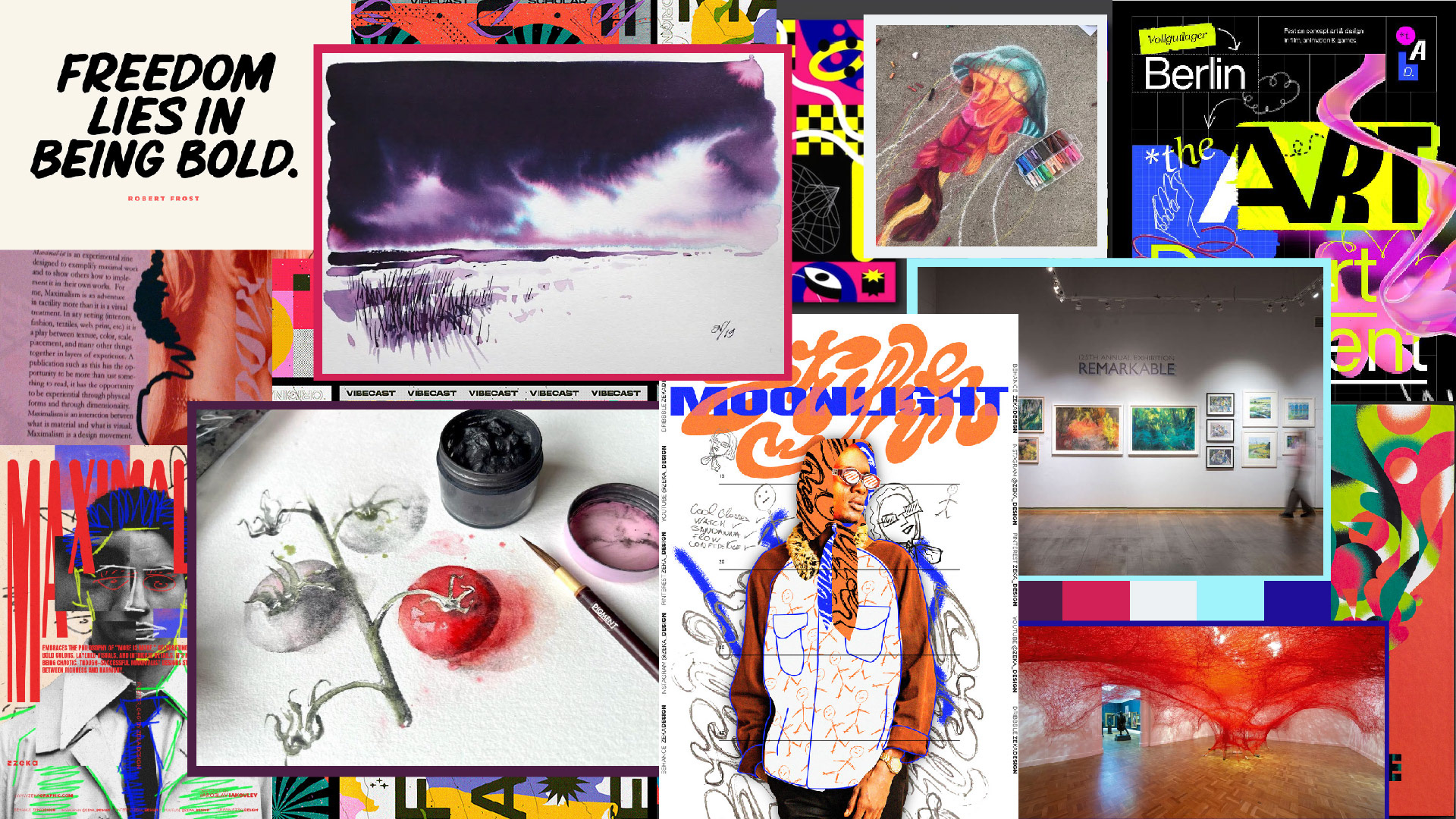
Moodboard
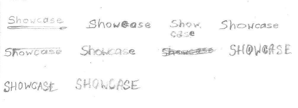
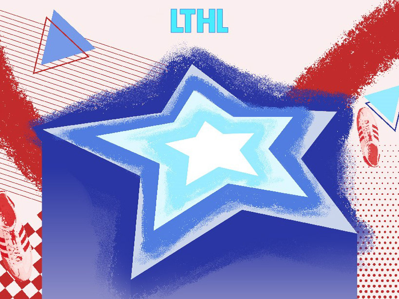
Logo sketches
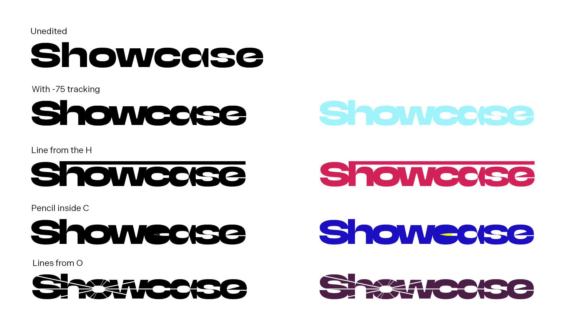
Logo development
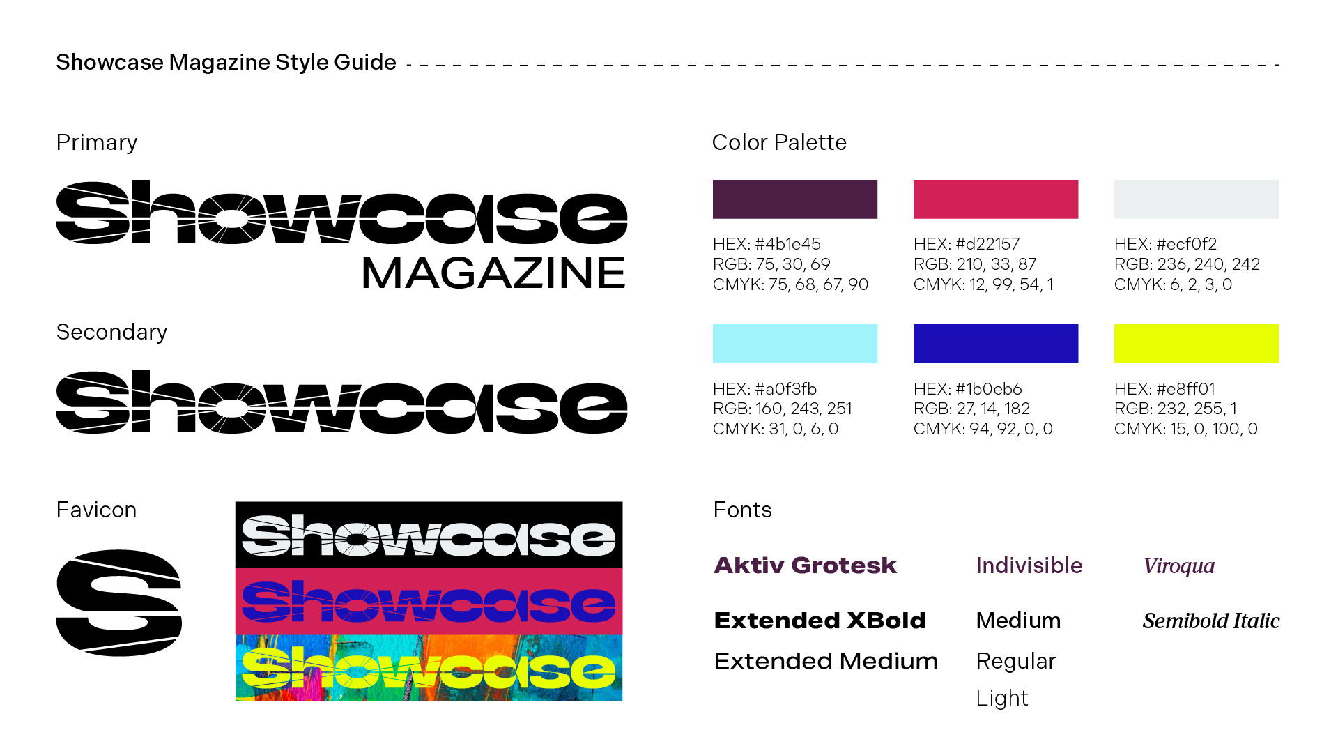
Initial style guide
Project Experience
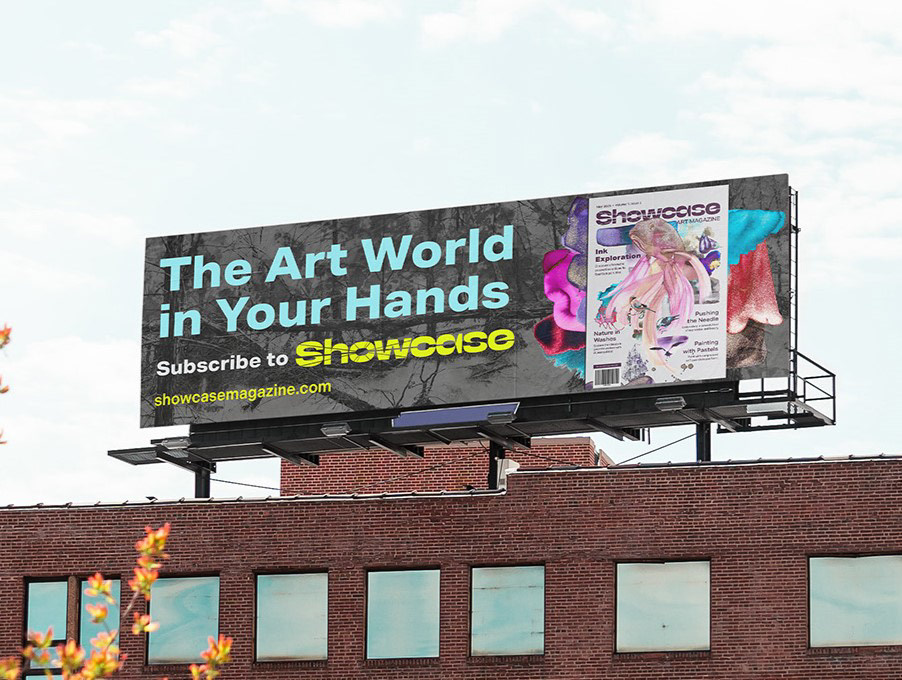
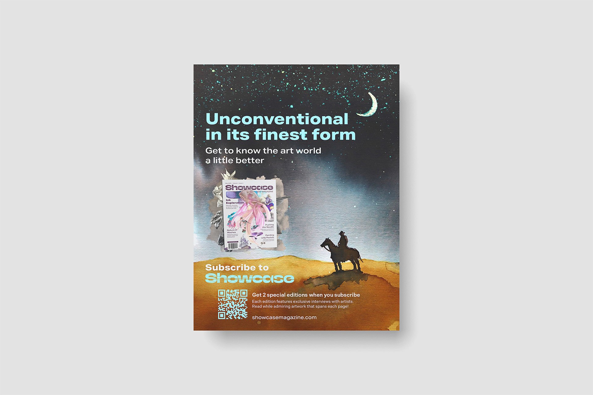
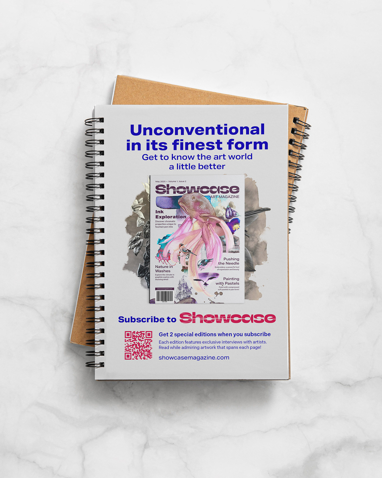
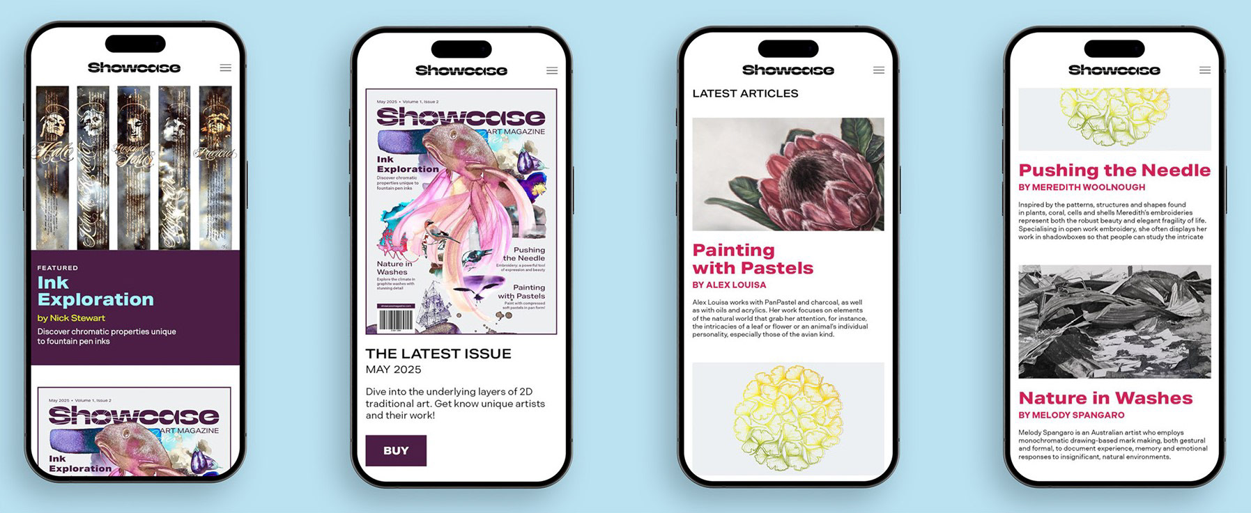
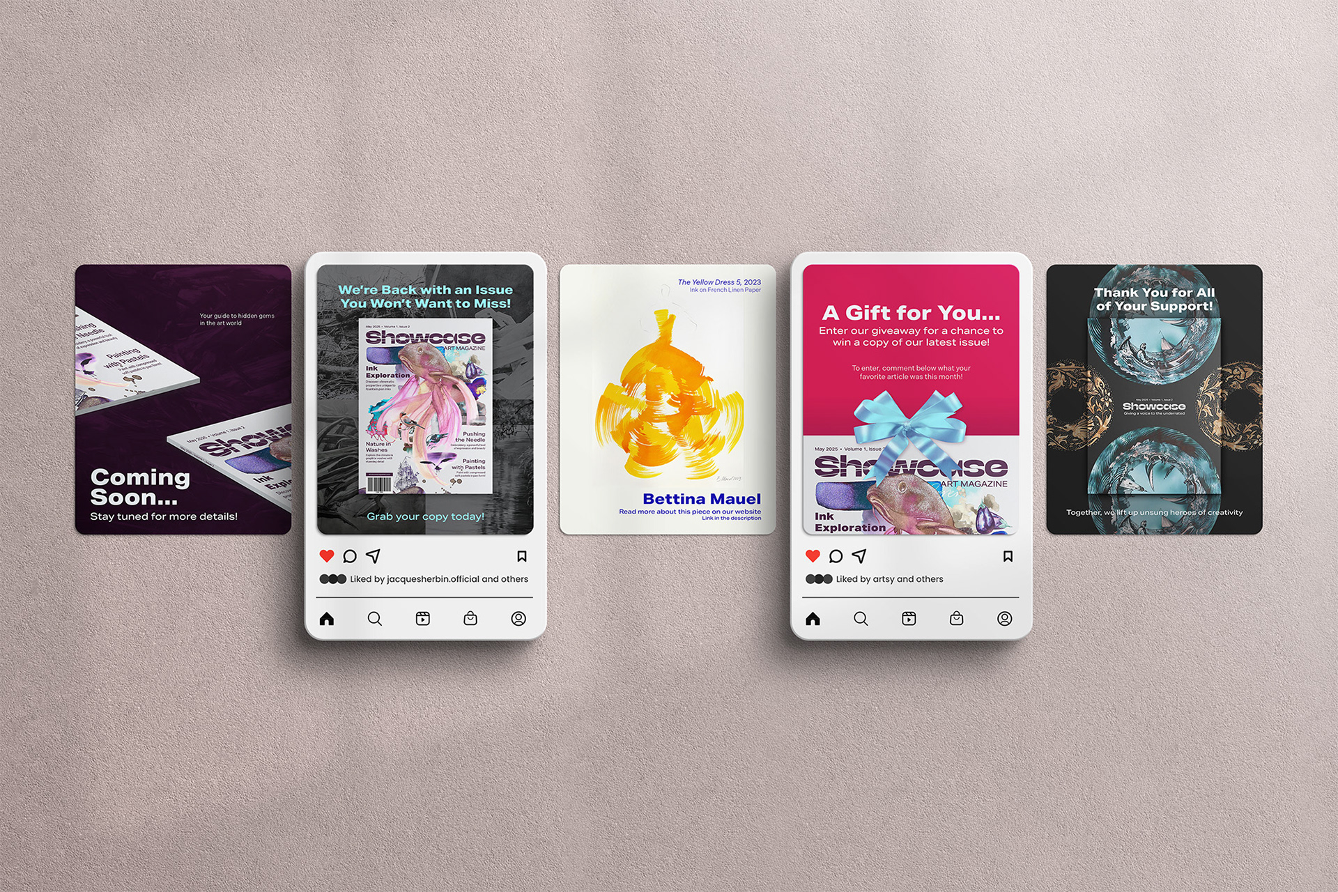
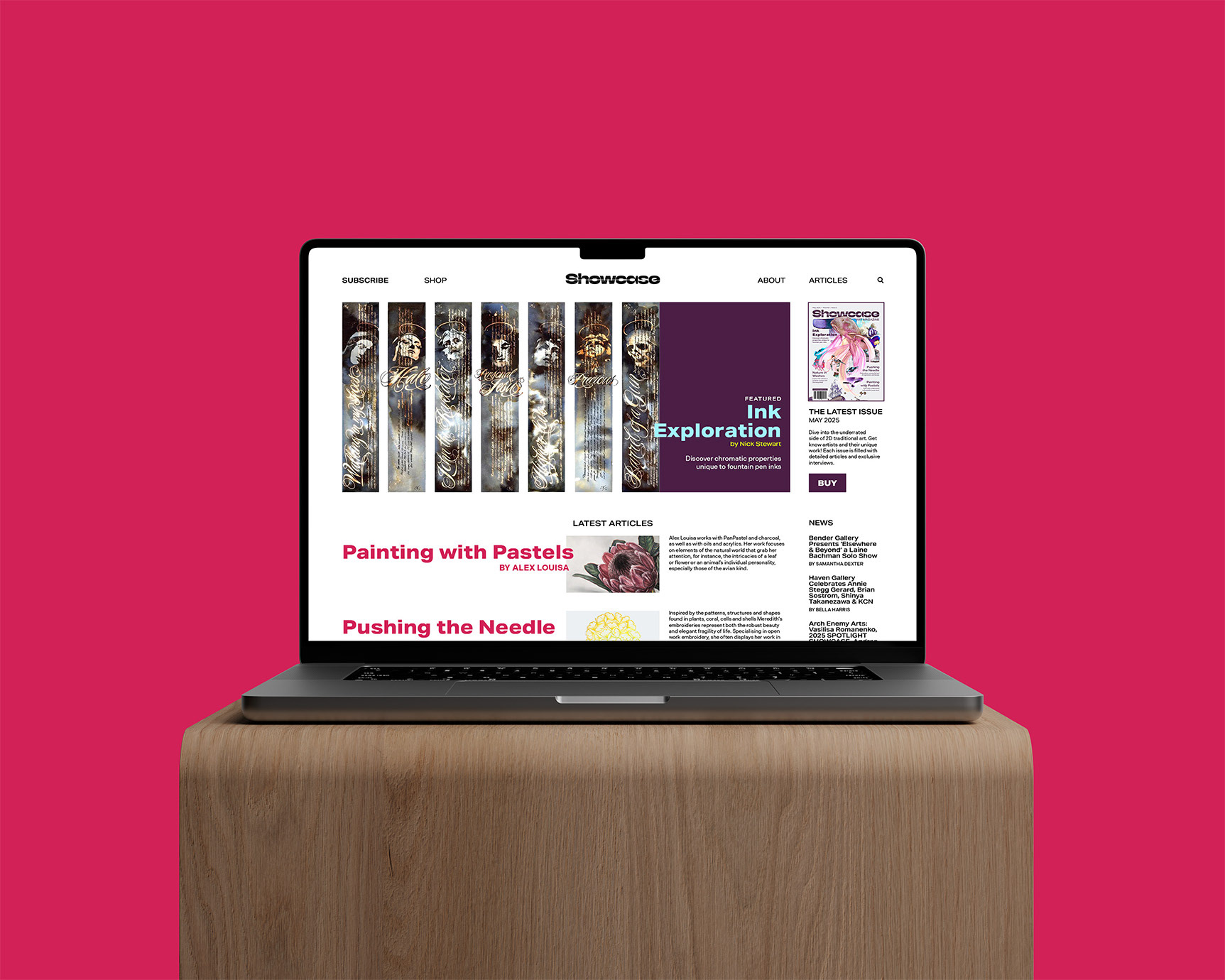
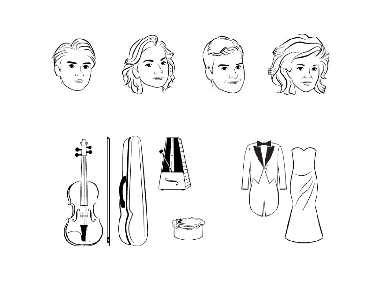
The logo uses the Bacalar typeface, which I found fun on its own and to modify. Brand development was relatively straightforward. The main thing I had in mind was it had to be loud. The most difficult part of this project was how to treat artwork, both in terms of editing and hierarchy. After all, the artwork is kinda the point of the magazine, so it can’t be overshadowed by whatever else is going on. For the majority of the artwork, I removed the background and arranged them collage-style. It was very tedious.
Project Outcome
I definitely stepped out of my typical design sense/habits with this project, so that’s a win. Some other wins were trying out more complex magazine spread layouts and making a brand guidelines book for the first time.